


A guide to the best data visualisation tools for 2025

Imagine trying to solve a puzzle without seeing the pieces — tricky, right? That’s what analyzing raw data without visualization feels like. Data visualization is the art of transforming complex data into understandable, interactive, and visually appealing charts, graphs, and maps. It helps uncover hidden patterns, trends, and insights, turning numbers into narratives. In this blog, we’ll walk you through the best data visualization tools for 2025, exploring how they empower students, learners, and budding data analysts to bring data to life.
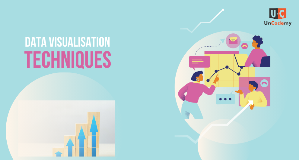
Why Data Visualisation Matters
As the saying goes, “A picture is worth a thousand words.”
For data scientists and analysts, a well-crafted visual can replace endless spreadsheets and statistical jargon. Visualization makes complex data accessible, enhances decision-making, and tells compelling stories.
For example: Imagine a student tracking study hours versus grades. A simple scatter plot can reveal correlations faster than a table of numbers ever could.
What Does a Data Analyst Do?
Before we dive into tools, let’s quickly understand the role of a data analyst. These professionals collect, clean, and interpret data to guide business decisions. One of their key tasks is to visualize data to communicate findings clearly to non-technical stakeholders.
Top Data Visualisation Techniques to Know
Before choosing a tool, it’s helpful to know common visualization techniques:
- – Bar Charts: Great for comparing categories.
- – Line Graphs: Show trends over time.
- – Scatter Plots: Highlight relationships between variables.
- – Heatmaps: Display data intensity with color gradients.
- – Geospatial Maps: Visualize data across locations.
With these techniques in mind, let’s explore the best data visualisation tools for 2025!
1.Tableau — The Industry Giant
- Why It’s Great: Intuitive drag-and-drop interface, powerful analytics, and real-time data connectivity.
- Best For: Students, beginners, and advanced users alike.
- Example: You can use Tableau to visualize student performance across subjects, breaking down scores by region or school.
2. Power BI — The Business Intelligence Hero
- Why It’s Great: Seamless integration with Microsoft products, robust data modeling capabilities.
- Best For: Aspiring business analysts and Excel enthusiasts.
- Example: Create dashboards tracking social media engagement, showing daily likes, shares, and comments.
3. Google Looker Studio — The Free Champion
- Why It’s Great: It’s free, web-based, and connects easily with Google products.
- Best For: Beginners experimenting with data.
- Example: Visualize website traffic, displaying which pages get the most visits over time.
4. D3.js— The Developer’s Playground
- Why It’s Great: Fully customizable, endless creative possibilities.
- Best For: Coding enthusiasts wanting complete control.
- Example: Create interactive network diagrams to visualize connections between research topics.
5. Plotly — The Interactive Innovator
- Why It’s Great: Combines ease of use with advanced interactivity.
- Best For: Students exploring Python or R.
- Example: Build interactive 3D scatter plots for visualizing multi-dimensional data.
How to Choose the Right Tool?
Ask yourself:
– What’s your skill level? (Beginner? Start with Tableau or Google Looker Studio.)
– What type of data are you visualizing? (Geospatial? Try Power BI.)
– Do you want full control? (Like coding? Go for D3.js or Plotly.)
Remember: “The best tool is the one you’ll actually use.”
Final Thoughts: The Power of Visual Storytelling
Data visualization is a superpower. It bridges the gap between data and understanding, helping us see the unseen. Whether you’re a student, a budding data analyst, or just curious, learning to visualize data opens up endless possibilities.
So, pick a tool, experiment with data, and start telling stories. After all, as Edward Tufte, the pioneer of data visualization, once said: “Good design is clear thinking made visible.”