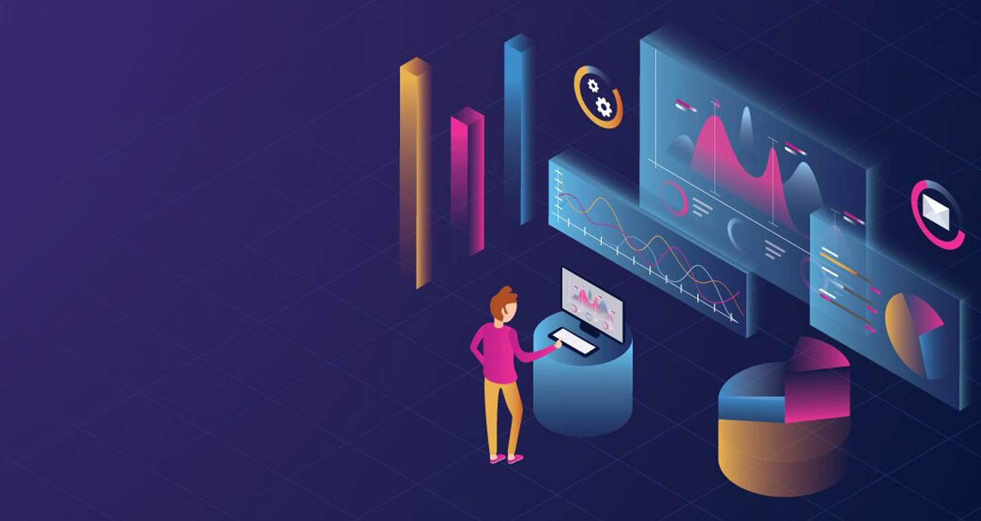
What Makes Charts So Powerful in Data Science?
Pradyumn Singh / 1 day ago - 0
- 8 min read
The benefits of charts become clear when you remember that our brains are geared toward processing visual information much quicker than text or numbers. When you are studying in a data science course in Noida, you will learn that a single chart can communicate what may take pages of written analysis to describe, if done correctly.
For example, if someone asked you to compare the sales performance of five different products over a twelve-month time frame, would you rather read a spreadsheet with 60 different numbers or a colorful line chart that instantly shows the trends? That is the visual power of what data needs to be represented as - you can take complex information and translate it into simple understanding.
The Science Behind Visual Data Processing
To appreciate the power of charts, it takes just a moment to recognize how we, humans, process information. We can visually process items up to 60,000 times faster than text. While that may be a fun statistic, it is a rule when you're trying to communicate information using data.
In your course for data science in Noida, you will see that this timing is almost irrelevant. We do more than just visualize faster. Our brains typically recognize our environment and are very adept at noticing patterns and variations. In addition, if we graphically represent information, we seem to understand relationships better. Because of this reason, people are adapting to learn and use data visualization as an important tool in this data-driven world.
Top Advantages of Charts You Need to Know
1. Instant Pattern Recognition
The most important part of utilizing charts is that they provide visibility to patterns that you may not have noticed in just rows of raw data. Think about the difference between scrolling through thousands of rows of sales data versus scanning a chart that summarizes the same data and shows seasonality trends, durations of growth, or immediate losses in performance. You will learn through real data science projects in your data science course in Noida that charts can help you discover trends quickly. Considering trends over time for customer behavior can deliver answers that would take hours to unearth using traditional data analysis.
2. Simplified Complex Information
Charts are particularly good at taking complicated datasets and presenting them in an accessible way. Charts can communicate complicated findings to executives, clients, or colleagues. There are advantages to the presentation of data via charts; they can convey complicated statistical findings in easily understood formats.
Consider charts as translators from data speak to business speak; they help translate technical analysis into a more natural understanding of data to allow decision-makers (who may not have technical backgrounds or the knowledge to recount data findings) to take action based on your insights.
3. Enhanced Memory and Retention
Visual information tends to stay in our memories significantly better than numbers or words alone. This is just another important consideration of the benefits of charts, which you will appreciate during your data science course in Noida and for the future as well. When a chart is interesting and memorable, people can recall its main points long after the presentation has ended.
This ability to increase memory retention is helpful for presentations, but also useful in your own analytic work. Visual information makes it easier to remember what you found, and enables you to build off your own discoveries when you gain a better understanding or deeper insight into your data.
4. Quick Comparison Capabilities
Charts simplify comparing and contrasting value, category, or period data, and they make those comparisons easy. Bar charts allow you to quickly compare values for certain categories, while line charts allow you to compare how different metrics perform over time. The benefits of charts do not stop with individuals being able to easily compare or contradict information; the comparative power of charts allows users to gather better information for better decisions more quickly.
In many instances of business scenarios, after the data science course in Noida, this comparison capability will be very helpful. Whether comparing marketing campaign success, sales figures among different regions, or product adoption numbers, a chart provides the clarity to make informed decisions.
5. Universal Communication Tool
Numbers may hold different meanings depending on culture and context, but visual representations such as charts are universally understood. This characteristic makes charts powerful forms of communication, whereby knowledge of language and technical terms is irrelevant. Charts have many advantages, one such advantage is communicating to a variety of audiences without losing the effectiveness of the data.
This universal communication ability is incredibly beneficial in today's globalized business environment. It is clear that stakeholders in Noida or across national borders and cultures; a good chart clearly and effectively conveys your point.
Different Types of Charts and Their Specific Advantages
Bar Charts: Bar charts are ideal for comparisons of different categories or rankings. The advantages of bar chart's charts include visual hierarchy and ease of interpretation. When you want to show which product line brings in the most revenue or which marketing channel generates the most leads, bar charts convey the meaning instantly.
Scatter Plots: Scatter plots are a great way to explore relationships between variables. They can show you correlations, outliers, and cluster patterns that are often not apparent in other charts. These are important tools for a variety of predictive analytics and machine learning projects.
Line Charts: Line charts are extremely effective when showing changes over time. They are invaluable for identifying trends, seasonal variations, and growth trends. In your Data Science Course in Noida, you will be using line charts for time series analyses and forecasting assignments.
Pie Charts: Pie charts are second to none when you need to show how pieces add up to a whole. Pie charts instantly illustrate proportional relationships and are ideal for budget allocations, analyzing market share, and showing demographic distributions.
Future of Data Visualization
The benefits of digital charts continue to evolve with more advanced technology. For example, artificial intelligence is starting to suggest optimal chart types without user input. Virtual reality and augmented reality enhance opportunities for a more immersive experience of exploring data.
Voice-activated interfaces enable effortless data visualization.
Keeping in the loop with these trends will help ensure that your skill set has value throughout your career. The foundation you build during your data science course in Noida will definitely serve you well in the future.
Transforming Data into Visual Stories
The advantages of charts go far beyond data display - they represent a new way of interacting with information. Whether you are starting your Data Science Course in Noida or are already using data in a professional capacity, learning how to communicate through design will increase your influence and utility.
Charts are not simply a means of making reports nicer or making presentations more fun - they are powerful tools for exploration, communication, and action that can reshape how organizations perceive and act on their data. Crafting engaging, truthful, and insightful visualizations is quickly becoming an important skill in the data economy.
As you hone your skills in data visualization, keep in mind that the purpose is not just to communicate beautiful charts - it is to extract the insights embedded in your data, share those insights in a meaningful way, and activate your audiences into action. Oftentimes, the path from data to insights is complicated and uncertain, but charts create a pathway from raw data to knowledge and make the journey accessible to all.
Frequently Asked Questions (FAQs)
Q: What's the most important advantage of using charts over tables?
A: The biggest advantage is the speed of comprehension. Charts allow viewers to grasp key insights instantly, while tables require time to read and analyze individual values.
Q: How do I choose the right type of chart for my data?
A: Consider what story you want to tell. Use bar charts for comparisons, line charts for trends over time, pie charts for proportions, and scatter plots for relationships between variables.
Q: Can charts be misleading or manipulative?
A: Yes, charts can distort data through inappropriate scales, misleading visual elements, or selective data presentation. Always strive for honest, accurate representation.
Q: Do I need expensive software to create effective charts?
A: Not necessarily. Many free tools like Google Sheets, free versions of visualization software, and open-source options can create professional-quality charts.
Q: How many data points can I include in a chart before it becomes confusing?
A: This depends on the chart type and complexity, but generally, aim for clarity over completeness. If a chart becomes cluttered, consider filtering data, grouping categories, or using multiple related charts.