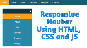
Create a Responsive Navbar Using HTML and CSS
Mr. Bambam Kumar Yadav/ 3 days ago - 15
- 11 min read
For today's coders, knowing how to make a navbar that works on any screen using just HTML and CSS is a must-have skill. It shows you get tech, care about users, and understand design. You can learn this skill in Uncodemy’s developer course, where they teach how to build layouts that look good and work well.
Why a Responsive Navbar Matters
- Works Everywhere: Your site should be easy to use, no matter if people are on a computer or phone.
- Looks Pro: A navbar that adjusts to fit the screen shows you know your stuff when it comes to web development.
- Keeps People Coming Back: When your site is easy to get around, folks stick around longer and visit again. They'll also find what they're looking for.
- Helps Search Engines Find You: Search engines like sites that work well on all devices, so your site will rank higher.
- Good for Your Resume: If you're taking Uncodemy’s full-stack developer course, you need a responsive navbar on your site.
Step 1: Understand the Navbar’s Essential Components
Your brand's logo or name is usually in the top left – click it to get back to the homepage.
Navigation Links: You'll probably see Home, About, Projects, or Contact to get around.
Mobile Menu: On phones, look for the three-line icon for the menu. Tap it, and it shows all the pages.
Call-to-Action Button: There's usually a Sign up, Contact, or Start Free Trial button next to the links if you're on a computer.
Dropdown Menus: Some sites feature menus to help organize a large number of pages.
Responsive Design: The site adjusts its appearance to fit your phone or computer screen.
Step 2: Plan a Device-Agnostic Structure
Start thinking about phones first – something we push in Uncodemy’s developer course.
On phones: The menu hides behind a button. Navigation stuff shows up in one column. Links and buttons are large, making them easy to tap.
On tablets: The menu could get bigger or show icons and shorter text.
On computers: All the links and buttons are in a row. If you have more options, put them in dropdowns or at the bottom of the page.
Pro Tip: Put the most important links first. Don't put too much stuff up there – 4 to 6 main links is best. Put the rest in dropdowns or the footer.
Step 3: Responsive Layout and Visual Design
Menu Design Tips:
Flex Layouts: For bigger screens, put menu items side-by-side. On phones, stack them on top of each other.
Spacing: Keep things tidy with even padding and margins.
Alignment: Line up your brand/logo, menus, and call-to-action buttons just right, or it feels off.
Looks Matter:
Color: Stick to your brand's colors, making sure text is always easy to read (either light text on a dark background or the opposite).
Fonts: Pick fonts that are simple to read. The current page should stand out.
Size: Make sure links are big enough to click with a thumb or mouse.
Branding Basics:
Use your brand's colors, logo, or avatar. Memorable menus help your site get noticed, as mentioned in Uncodemy's full-stack developer course.
Step 4: Responsive Behavior and Media Queries
Okay, here's a more human-sounding rewrite of that text:
Breakpoints: Make a plan for when your layout shifts. Usually, this is around 768px for tablets and 480px for phones.
Menus that Fold: When the screen gets smaller, hide the regular navigation links and put a toggle icon there instead.
Panels that Open: Tap the toggle once to see the menu, tap it again to close it.
Nice Transitions: Add a smooth animation when the menu opens. It makes everything look more polished.
Pro Tip: Check your navigation at each breakpoint. Make sure no links vanish or run into each other.
Step 5: User Experience and Accessibility
Good navbars these days are made so everyone can use them easily:
Easy to Tab Through: You can jump between links using just your keyboard.
Clear Focus: When you're tabbing, you can easily see which link is selected.
Labels that Make Sense: Buttons and icons have labels, especially helpful for screen readers. For example, a menu button might say Open main menu.
Good Color Contrast: Text and icons are easy to see against the background.
Touch-Friendly: Links and buttons are spaced out, so they're easy to tap on a phone or tablet.
Uncodemy’s full-stack developer course takes accessibility seriously, so you get the real deal when learning web dev.
Step 6: Navigation Patterns for Complex Sites
For big, info-packed websites, here's how to make getting around easier:
Dropdown Menus: These show more pages when you hover over the main links. On phones, tapping works better than hovering.
Sticky Navbars: The menu stays put when you scroll, which is great for long pages because it saves you time.
Mega Menus: If you have loads of pages, these wide dropdowns group them into labeled sections.
Logged-In Views: The menu changes depending on whether you're logged in, like showing a Dashboard or Logout option.
Step 7: Common Mistakes and How to Avoid Them
| Mistake | Solution |
|---|
| Overcrowded or tiny links | Prioritize and group; ensure links are tap-sized |
| Missing mobile or tablet styles | Always test on multiple devices |
| Poor contrast/hard-to-read text | Use proven color pairs meeting contrast standards |
| Unlabeled toggle/hamburger menu | Add ARIA labels/descriptions for accessibility |
| Lack of active page indicators | Make the current section visually distinct |
Real-World Applications and Project-Ready Insights
What You Can Do With Navigation Bars
Personal Portfolios
If you're a developer, a smooth, easy-to-use navigation bar is key to your portfolio. Uncodemy students show off their work to potential employers and clients with navigation that just works.
Business Sites
Got a small business, agency, or blog? You need navigation that adjusts to fit any device. This helps people find what they need – services, bookings, or important info.
Web Applications
SaaS dashboards and online platforms don't just use navigation for links. They also use it for notifications, user profiles, and quick jumps to account settings or help.
E-commerce
Online stores use navigation to display categories, search options, and shopping carts. The goal? Make shopping easy on any device.
Best Practices for Lasting Impact
- Make your site easy to get around; simple is better.
- Just show the important links. Put the rest in drop-down menus or at the bottom of the page.
- Update the way people get around as your site grows.
- Ask people what they think, see if anyone has trouble finding stuff, and make it better.
- Keep testing things out as new phones and browsers come out.
Navbars and Full Stack Integration
In Uncodemy's full-stack developer course, you'll learn more than just how things look on the front-end. Check out what else you'll be able to do:
Dynamic Menus: Create menus that change based on who's logged in or what their job is. The data can come from a database.
API-Driven Navigation: With single-page apps, the navigation bar updates right away when someone logs in or something changes.
Authentication States: Show logged-in users their profile settings or exclusive content directly in the nav bar.
Theming: Let users switch between dark and light mode, or even use their own color schemes, and update the nav bar style as they wish.
Conclusion
A good navbar is what makes a website feel modern and easy to use. If you get good at making them look and work great on any device, it not only makes your web stuff better but also tells employers and clients you know your stuff – something Uncodemy's full-stack developer course can help you do.
Think about making navigation user-friendly, accessible, and a little bit stylish. That way, people will feel welcome no matter what device they're using. Keep in mind that navigation is more than just links; it's like saying, Come on in, look around, and come back again.
So, start building, keep trying new things, and make every website you work on awesome because of how well it responds to different screen sizes.
Frequently Asked Questions (FAQs)
Q1: Can I really build a responsive navbar using only HTML and CSS?
Absolutely. By leveraging semantic HTML for structure and CSS for layout, spacing, and interactivity (including media queries), you can achieve polished, responsive navigation. JavaScript is useful for advanced animations or dynamic behavior, but it isn’t mandatory for the basics.
Q2: How many links should a navbar include?
Ideally, 4 to 6 primary links. Extra links can go in dropdown menus or the footer to keep navigation clean and scannable.
Q3: How do I ensure nav accessibility?
Use logical markup, descriptive labels, sufficient color contrast, and visible focus states, and test navigation with keyboard alone.
Q4: What’s the difference between a hamburger menu and a dropdown?
A hamburger menu toggles the entire navigation panel (especially for mobile), while a dropdown menu reveals additional links under one main item.
Q5: Will I build navbars as a student in Uncodemy’s full-stack developer course?
Yes. Navbar projects are a required part of the curriculum and assessments, appearing in both solo and group projects to ensure fluency and real-world readiness.