If you're a web developer, you need to be familiar with responsive web design. There are tons of devices out there—phones, tablets, laptops, you name it—all with different screen sizes and abilities. Making sure your site looks good on all of them can be tough. CSS media queries are crucial for creating layouts that adapt to various screen sizes. That’s why they're a big part of Uncodemy's Full Stack Developer course in Noida; they are super important for doing web dev work.
This guide will explain CSS media queries in simple terms, show you how they work, and give you some examples you can actually use. That way, you can build websites that are easy to use and look awesome, no matter what device someone is using.
What Are CSS Media Queries?
Media queries in CSS let you change styles based on device stuff. So, you can tweak how your site looks depending on screen size, orientation, resolution, and user settings (like dark mode).
You can do things like:
Change layouts for desktops, tablets, and phones.
Change fonts and spacing to make things easier to read.
Hide, resize, or move things around to fit smaller screens.
Make your site look and work great on any device.
Syntax and Structure of Media Queries
A media query uses the @media rule to see if certain things are true and then uses specific CSS styles if they are.
Here's what it looks like:
Media type: This is the kind of device, such as all, screen, or print.
Media features: These are the things you want to focus on, like the smallest or largest width, or the orientation.
Logical operators: These let you mix and match conditions (and, not, only)
Here's the basic way to write a media query:
                    css
                    @media [media-type] and ([media-feature]) {
                    /* CSS rules go here */
                    }
So, you could set a background color, but only if the screen is at least 600 pixels wide.
Why Learn Media Queries in a Full Stack Developer Course?
At Uncodemy's Full Stack Developer course in Noida, creating websites that look good on any device isn't just a skill; it's key to getting hired. Today's employers want developers who can:
Make layouts adjust to different screen sizes using media queries.
Make sure websites are accessible and adapt to user settings.
Find and fix layout problems quickly on different browsers and devices.
Knowing media queries helps you go from making basic web pages to creating smooth, professional websites.
Practical Examples of Media Queries
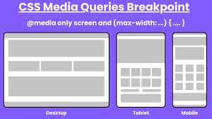
1. Basic Screen Width Breakpoint
Switch overall styles for mobile versus desktop:
Condition: Apply styles when the screen width is 600px or less (common mobile threshold).
Effect: For mobile devices, increase font size for readability and stack navigation elements vertically.
                    text
                    @media only screen and (max-width: 600px) {
                    /* Adjust styles for small screens */
                    }
Example Use Cases
Stack menus vertically on phones
Increase button sizes for tap accuracy
Hide non-essential graphics
2. Multiple Breakpoints
Most modern designs respond to several common device widths:
Device
Min/Max Width Rule
What Changes?
Large desktop
min-width: 1200px
Wide layouts, more columns
Tablet
768px – 1024px
Reduced columns, larger text
Phone
max-width: 767px
Single column, menu collapses
By combining multiple queries:
                    text
                    @media (min-width: 768px) and (max-width: 1024px) {
                    /* Tablet-specific styles */
                    }
3. Orientation Queries
Adapt layout to device orientation:
Portrait: For reading or scrolling content
Landscape: For wide layouts or navigation bars
                    text
                    @media (orientation: landscape) {
                    /* Styles for landscape screens */
                    }
4. Responsive Image and Typography
Switch images or font sizes for legibility:
Font grows on larger screens, shrinks on mobile
High-res images served for retina displays or larger monitors
5. Dark Mode and User Preferences
Cater to system-level settings:
                    text
                    @media (prefers-color-scheme: dark) {
                    /* Dark mode styling */
                    }
Adjust background, text, and accent colors for users with preferred dark themes.
6. Combining Conditions
Combine several criteria with logical operators:
                    text
                    @media screen and (min-width: 768px) and (orientation: landscape) {
                    /* Tablet in landscape mode */
                    }
How Media Queries Empower Responsive Design
Basically, media queries are super important for making websites that look and work great on any device, like phones, tablets, and computers, since they let the website change how it looks depending on the screen size.
Why they're great:
People get a way better experience no matter what they're using.
It makes websites easier to use for everyone.
Search engines like websites that work well on phones, so it can help with that.
You only need one set of code for everything, which saves time and money.
Best Practices for Using Media Queries
Start with mobile: Make your basic styles for phones first, then add changes for bigger screens.
Set smart breakpoints: Don't aim for specific devices; use widths where your layout needs changing.
Keep queries tidy: Group related queries by layout, part, or feature.
Don't use too many breakpoints: Stick to how the content flows naturally, not every device type.
Test a lot: Always check your site on real devices and emulators.
Media Queries in the Real World: Project and Job-Ready Skills
With Uncodemy's Full Stack Developer course in Noida, you’ll learn how to use media queries by actually using them to build things like:
Your own portfolio site
Responsive designs with a team
Online stores and blogs
Production-ready pages on real websites
You'll also get good at finding responsive bugs and thinking about breakpoints and user needs.
Common Media Query Breakpoints and Their Use Cases
Breakpoint
Typical Device
Example Use
max-width: 480px
Mobile portrait
Simplify nav, scale text/buttons up
max-width: 768px
Tablet portrait
Adjust grids, touch targets, collapse menus
min-width: 1024px
Desktop/laptop
Multi-column layouts, larger content areas
orientation: landscape
Tablets/phones wide
Reorder menus, display more info horizontally
prefers-color-scheme
User preference
Switch to dark or light-themed colors
Media Queries for Accessibility and User Preferences
Media queries are mostly used to change how websites look on different devices. But they're becoming more useful for making websites that everyone can use easily. With modern CSS, developers can change designs not just for screen size, but also for people's accessibility needs and personal settings. Knowing how to use these media queries is a key skill for developers today. That's why Uncodemy's Full Stack Developer course in Noida teaches it.
1. Helping People Who Don't Like Motion
Some people don't like or get bothered by things that move on the screen, like animations. To make browsing easier and safer, browsers have a setting called prefers-reduced-motion. If developers see that this setting is on, they can turn off or simplify animations for those users.
How it actually works:
See when someone has turned on reduced motion on their device.
Stop CSS transitions, rotating image carousels, or other moving stuff, and use simpler things instead.
Make things easier to use for people who are sensitive to motion.
2. Working with High Contrast and Color Themes
More and more, devices and browsers let people ask for themes with high contrast, or switch between dark and light modes. The prefers-color-scheme and forced-colors media queries let developers:
Change background, text, and highlight colors to match what people want.
Make things easier to read for people who can't see well.
Make sure that things you can click on, form fields, and pictures are easy to see no matter what color mode is being used.
3. Making Text Easy to Read
If you use media queries to change the size of fonts, you can be sure that the main text and headings are easy to read. This is especially useful for people who like bigger fonts or have set a font size in their system. This means:
Changing font size, space between lines, or space around paragraphs for small screens or accessibility settings.
Making layouts that work well when people zoom in or change the text size.
Responsive Power for Every Web Developer
CSS media queries have totally changed how we make and see websites. They're super important for making websites responsive and work for everyone, now and later. If you take Uncodemy’s Full Stack Developer course in Noida, you will learn media queries, so you can build websites that look great on any device.
Knowing how to use media queries means you'll be ready to handle any challenge and build sites that people will like.
Frequently Asked Questions (FAQs)
Q1: Why only design for desktops? That seems kinda silly.
These days, most folks browse on phones. If your site's only for desktops, it'll be slow and clunky on phones. Plus, search engines won't like it. Media queries sort this out easily.
Q2: Do media queries slow stuff down?
Nope. If you do them right, your site loads the important bits first, then adjusts how it looks. Browsers only use the CSS they need.
Q3: Is managing tons of media queries a pain?
Not if you're planning. Keep your CSS in order, plan breakpoints based on your layout (not specific phones), and add comments to your queries, so it remains understandable.
Q4: Do media queries matter to backend folks?
Yep! Full stack devs should know both front and backend. They often have to fix problems or speed up how the site feels to people.
Q5: Does Uncodemy’s Full Stack Developer course in Noida teach media queries?
You'll learn media queries in the HTML and CSS parts. You'll also use them in group projects and get feedback on your code. This gives you experience for your portfolio and work.
Placed Students
Our Clients
Partners
Uncodemy Learning Platform
Uncodemy Free Premium Features
Smart Learning System
Personalized learning paths with interactive materials and progress tracking for optimal learning experience.