The Evolution and the Purpose behind BI Dashboards.
BI dashboards form part of the business intelligence strategy of organization, which is specifically designed to analyze data out of important datasets to enhance business decisions. Rather than creating spreadsheets manually, current BI systems allow access, analysis, presentation, and sharing of data through a web-based dashboard. This enables the stakeholders to read, make conclusions, and act with effective automation tools.
Ancestors to the modern BI tools were business decision support systems, which developed the first dashboards of BI in the 1970s. These initial dashboards were normally fixed and had basic charts and graphics with dials and indicators comparable to those in car dashboards to indicate the condition of the KPIs in operation. The 1980s developed executive information systems, a technology of data analysis and advanced reporting, which became a fundamental part of dashboards, sometimes known as executive dashboards of C-suite executives.
Dashboards were developed in the 1990s as BI software, data warehouses and online analytical processing machines became available, and the range of data analytics applications organizations could run grew. By the mid-2000s, interactive dashboards were further advanced with the introduction of self-service BI and data visualization tools which enabled end users to design and publish their own BI dashboards. Some BI products started to add AI features, including those provided in Microsoft Power BI in 2019, to derive insights out of text and image data, and other AI features, including automated data preparation and cleansing, have been added to other products since then.
The BI Dashboards contain key features and components.
BI dashboards can be described as having a number of key characteristics that allow them to be used and be effective in data analysis and visualization.
Integration and Visualization of Data.
BI dashboards are linked with a wide range of data sources which include data warehouses, data marts, data lakes, operational systems, industrial equipment and external data feeds to display current information. They are set up with varying data visualizations such as simple line charts and bar charts, as well as more complex formats of visuals such as bubble charts, heat maps, and scatter plots, to show various performance metrics and statistics. Data tables are also used to present an at-a-glance view of pertinent data values on dashboards and can be treated with color coding and other graphical manipulations to emphasize particular information such as sales decreases or financial losses. Text boxes provided and tooltips contribute to the interpretation of visualized data and give more context.
Interactivity
Interactivity is a key feature of modern BI dashboard software with features like user-friendly, highly customisable interfaces and dashboard templates.
Drill-down capabilities: This refers to the ability to drill-down a data visualization and retrieve more information, which may sometimes be a further visualization or data table in a hierarchical format. This enables further analysis of the underlying data which is critical in making correct, data driven decisions.
Data filters: Data filters allow users to narrow down data visualizations to date and time ranges, geographic settings, and other parameters to give them a more targeted view of data. Liveboards for example, with ThoughtSpot are unlimited drill paths and data visualization filters that are provided to help users navigate their data.
Customizable Interface: One of the best features of BI dashboards is that they can be customized to their needs, giving users the option to change the layout and choose KPIs that best fit their requirements.
Smart-driven Augmented Intelligence.
Other current BI solutions incorporate AI capability to augment data analysis and prediction. Artificial intelligence can be used to automate activities such as data preparation and cleansing, identify trends and insights, and predict upcoming trends, enabling enterprises to make more informed decisions. As an example, AI-driven algorithms can process the data of an employee and propose the most appropriate visualization modes, metrics, and KPIs based on the job position and duties. SpotIQ by ThoughtSpot offers AI-assisted information in the form of data visualizations or KPIs and its AI-powered engine keeps on analyzing data to detect anomalies, trends, and real-time insights to enable quicker decision-making.
Sharing and Collaboration
The BI dashboards also involve sharing of information with other people, thus making data analysis and decision-making collaborative. The characteristics enabling the rapid sharing of dashboards can aid in making sure that the teams are aligned on evidence-based decisions. An example of these is ThoughtSpot Liveboards which allow embedding insights directly into workflows and present up-to-date data easily, without the need to manually refresh data during presentations.
Benefits of BI Dashboards
BI dashboards are also becoming essential to enable enterprises to extract meaningful business insights out of their expanding data repositories.
Improved Decision-Making based on Data.
BI dashboards allow the executives to make better decisions and strategy plans by enabling them to make timely decisions and show important metrics and trends that are based on the latest information available. Such immediacy assists companies to promptly make informed decisions and minimizes the chances of obsolete plans. They enable real-time and confident data-driven decision making, e.g. a sales team deciding to shift marketing spend based on low inventory of a best seller.
Better Monitoring and Effectiveness of Performance.
Dashboards allow organisations to monitor the health of operations, business procedures and equipment in real-time on a daily basis to monitor and control them. They reduce the effort involved in data analysis by making number intensive data and business analytics metrics understandable to users who may not be proficient analysts. Dashboards easily facilitate real-time data monitoring and are best suited to keeping track of continuously changing data, as in the form of IoT devices that monitor water quality or air temperature. It also helps in finding trends in business enabling organizations to utilize the opportunities and solve issues.
Less Time and Cost to Analyze.
BI dashboard tools automate the process of data aggregation and visualization, which makes them useful in freeing up time to go deeper and think more strategically. They also make the process of reporting and creating dashboards automated through AI operations, where data set analysis is fast and KPIs and layouts are suggested. Reporting on multiple important data points, the overarching tendency to track key metrics and KPIs allows being proactive, managing performance, and track goals. It can save costs by detecting and fixing operational problems in time, e.g. plowing a parking lot so as to avoid lost sales because of a snowstorm.
Improved teamwork and involvement of the users.
Dashboards facilitate the presence of more collaborative data analysis and decision-making processes by sharing more information and enabling the development of a single perspective on company performance across departments. They are made easy-to-use and accessible to as many users as possible, so that anyone whether business leaders or operational teams can discover data on their own terms by interacting with features, such as drill paths and filters. BI applications that are self-service make it easier to deploy and use these applications by business analysts, managers, and even workers.
BI Dashboards have limitations.
In spite of their many advantages, the BI dashboards have challenges:
Design Complexity: Excessively flashy designs or dense designs can make dashboards hard to use and add too much visual information when it should only be necessary to represent the underlying raw data.
Missing Context: Dashboards may not give sufficient context to KPIs and other data, and it is not clear how they apply to end users.
Drill-down Problems: Sometimes it may be hard to drill-down and view the data that surface measures are based on.
Data Integrity: The analytics may be inaccurate in cases of misrepresentation or even failure to provide the relevant data. The quality of the data being displayed in a BI dashboard is what determines its integrity; poor data quality may result in misleading analyses by showing corrupted, duplicated or inaccurate data.
Best Practices of BI Dashboard Design.
The design of BI dashboard is essential to bring business insights to plain sight and allow data-driven decision-making.
User Involvement: Engage end users into the design and determine which data they need to monitor.
Iterative Approach: An iterative approach should be used to develop designs and test against user experience problems early in the design process.
Clarity and Simplicity: Emphasize on clarity and simplicity to make information easy to access and easy to understand by users of any level of technical skill. Do not show excessive information.
Data Quality: Maintain the information of BI dashboards, and have high-quality and consistent data to deliver accurate insights.
Customization: Provide the ability to make dashboards customized to individual departments or sections of an enterprise.
BI Dashboard examples and uses.
Organizations implement different operational and analytics dashboard to assist decision-makers at all levels.
Sales and Marketing dashboards: These dashboards are utilized by executives, managers, and other sales /marketing teams, and contain data on product sales, cost of sales activities, response rates, and lead generation to monitor the progress towards the goals and see where the trouble lies.
Customer Dashboards: Show information on the size of customer base, their churn and retention rates, revenue per customer, and lifetime value to help in the planning of marketing campaigns and sales.
Financial Dashboards: Show financial KPIs such as revenue, operating expenses, profits, cash holdings, assets, and liabilities to both businesses and finance departments to track their business performance and support financial planning.
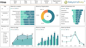
Human Resources Dashboards: Provide data on workforce, salary, demographics, hiring, employee satisfaction, turnover and cost data to support talent management and employee experience programs.
Business Intelligence Uncodemy Courses.
To people and institutions interested in tapping the potential of business intelligence, there are a number of educational sites that provide extensive courses. Uncodemy, among others, offers training programs aimed at helping learners gain the required skills required to work in Business Intelligence and data analytics.
PG course in Business Analyst.
Uncodemy also has a Post Graduate Program in business analyst which includes some of the key skills like business analytics, SQL, tableau, power BI, data visualization, and Agile methodologies. This is a program that is geared towards offering 100 percent placement support to the students.
Data Analytics Certification.
The Uncodemy Data analytics course is structured to master data analytics such as Python, SQL, Tableau, and Power BI. The course offers more than 12 practical projects and 100% job placement assistance, which allows the students to acquire practical experience.
Data Science Training Course.
Another solution that provides a detailed course in Data Science in Uncodemy, which teaches the different fields of Data Science and provides the learners with real-world skills. According to testimonials, Uncodemy offers placement assistance such as job openings, resume-building services and mock interviews.
Such courses are essential when it comes to future BI analysts and professionals who want to sharpen their data analysis, visualization and decision-making abilities utilizing contemporary BI tools and practices. Coursera and Udemy are other platforms where many business intelligence training programs are available to learn how to use tools such as Power BI, Tableau, and Qlikview to make decisions based on the available data.