If you want more people to sign up for your online event, the page must balance creativity with strategy. In this guide, we will explore everything you need to know about designing a virtual event landing page that drives high signups. Along the way, we will also highlight the Digital Marketing Course by Uncodemy, which equips learners with the skills to design high converting digital campaigns including event landing pages.
Why Virtual Event Landing Pages Matter
A landing page is the bridge between potential attendees and your event. Without a strong page, even the most valuable events can struggle to attract participants. Here are key reasons why the landing page plays a vital role:
- First impression: Visitors judge the professionalism of your event based on the landing page design. A cluttered or outdated look reduces trust.
- Clarity of information: It consolidates all necessary details such as agenda, speakers, and date in one easy to understand place.
- Conversion focus: Unlike general websites, a landing page has one goal, to drive signups.
- Audience segmentation: With tracking tools, you can understand visitor behavior and optimize accordingly.
A poorly designed landing page can result in lost opportunities. But a smartly crafted one ensures maximum participation.
Key Elements of a High Converting Landing Page
1. A Clear Headline
The headline is the first element that captures attention. It should answer the visitor’s most pressing question: What is this event and why should I care? For example, “Unlock the Future of Artificial Intelligence” is more engaging than “AI Webinar 2025.”
2. Engaging Subheadline
While the headline grabs attention, the subheadline provides clarity. It should briefly explain the value of attending the event. For example, “Join top industry leaders to explore AI trends and career opportunities.”
3. Visual Appeal
Humans process visuals faster than text. Use high quality images of speakers, branded banners, or even short teaser videos to create excitement. A visually appealing page also builds trust and professionalism.
4. Concise Event Details
Provide the essential information in a clean format. This includes the date, time, platform (Zoom, Teams, or custom), and the expected duration. The easier it is for visitors to find this information, the better.
5. Compelling Call to Action (CTA)
The CTA button is the ultimate goal of the page. Use action oriented words like “Reserve My Spot” or “Join the Event.” The button should be bold, stand out in color, and appear multiple times across the page.
6. Speaker Highlights
People often sign up for events to hear specific experts. Include speaker profiles with photos, short bios, and achievements. This not only adds credibility but also creates excitement among attendees.
7. Social Proof
Adding testimonials, previous event snapshots, or logos of partner companies can reassure visitors that the event is worth attending.
8. Registration Form
The form should be simple and short. Only ask for the information you truly need such as name, email, and profession. Long forms discourage signups.
Designing for User Experience
Keep it Simple
A clutter free design ensures visitors do not feel overwhelmed. White space is not wasted space; it helps guide the eye to important elements.
Optimize for Mobile
A large portion of your audience will view the page on mobile. Ensure responsive design, fast loading speed, and easy scrolling.
Easy Navigation
Although a landing page is usually single paged, if you include sections such as agenda or FAQ, provide anchor links that allow smooth navigation.
Fast Load Time
If the page takes too long to load, users are likely to exit. Compress images, use efficient hosting, and optimize scripts for performance.
Crafting the Right Messaging
The copy on your landing page should focus less on features and more on benefits. Instead of writing, “Our event has 5 sessions,” you could write, “Gain actionable insights through 5 expert led sessions.” Benefits show the visitor what they will gain.
Tone is equally important. Use conversational yet professional language. Imagine explaining the event to a friend who might be interested. That human touch resonates better than overly technical jargon.
Leveraging Psychology in Design
Scarcity
Phrases like “Seats are limited” or “Early bird registration ends soon” can create urgency.
Social Validation
Show how many people have already signed up or highlight the popularity of past events.
Reciprocity
Offer a free resource, such as an ebook or toolkit, in exchange for signing up. People appreciate added value.
Tools and Platforms to Build Landing Pages
You do not always need to code from scratch. Several tools make designing virtual event landing pages easier:
- WordPress with plugins: Flexible and customizable.
- Unbounce or Instapage: Drag and drop builders focused on conversions.
- Eventbrite: Built specifically for event registration.
- Custom coded pages: Ideal if you want full control and branding.
Choosing the right platform depends on your technical skills, budget, and design goals.
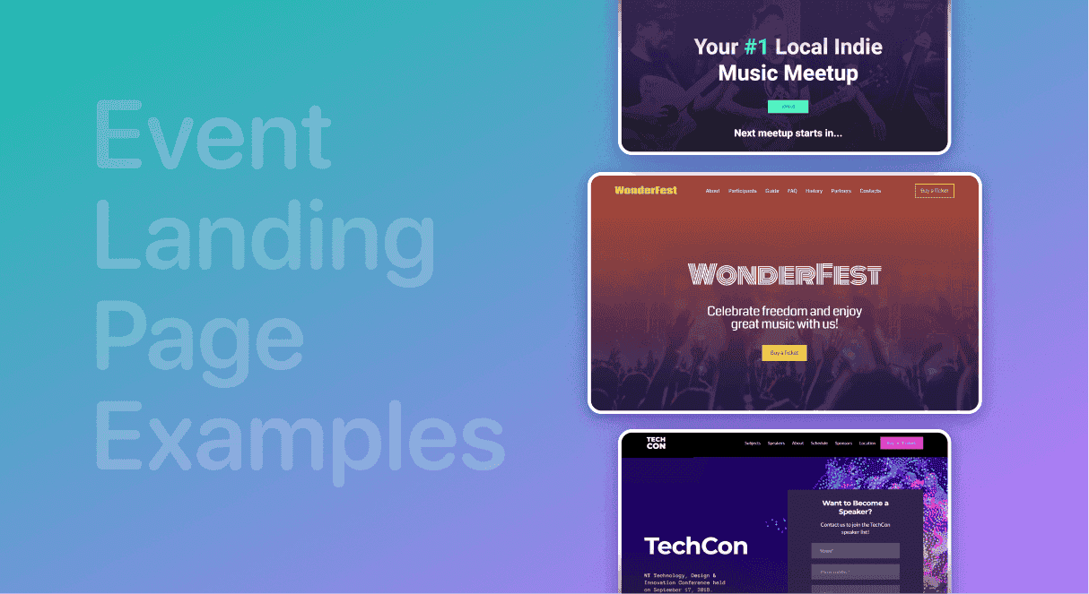
Case Study: A Successful Virtual Event Landing Page
Imagine an upcoming digital marketing summit. The headline reads, “Master Digital Growth in 2025.” The subheadline highlights, “Learn strategies from industry leaders who built million dollar campaigns.”
The landing page includes speaker photos, bold CTA buttons, and a countdown timer to build urgency. Social proof is added by showcasing logos of companies that attended last year. The page is simple, mobile optimized, and includes testimonials.
The result? Thousands of signups in just a few weeks. This is the power of smart design and psychology.
Mistakes to Avoid
- Overloading with text: Long paragraphs without visuals discourage readers.
- Generic CTA: Buttons like “Submit” do not inspire action.
- Ignoring testing: A design that works for one event might not work for another. Always A/B test headlines, colors, and CTAs.
- Lack of follow up: Even the best landing page fails if you do not follow up with registrants through confirmation emails and reminders.
The Role of Analytics
A landing page should not be static. Use tools like Google Analytics or Hotjar to monitor visitor behavior. Track metrics such as bounce rate, conversion rate, and time spent on page. These insights help you make informed improvements.
For example, if many users exit before filling the form, consider simplifying the form or moving it higher on the page.
Connecting Learning with Practice
Designing a virtual event landing page requires a mix of design skills, marketing knowledge, and user psychology. This is where professional training can make a difference. Courses such as the Digital Marketing Course by Uncodemy in Delhi cover topics like landing page design, conversion strategies, and campaign optimization. Learners gain practical skills that they can immediately apply to projects like creating high converting event pages. Subtle yet significant, these courses ensure you stay ahead in the fast evolving digital space.
Conclusion
A virtual event landing page is more than just a registration form. It is the story, value proposition, and persuasion tool that convinces visitors to take action. By focusing on clarity, simplicity, strong visuals, persuasive copy, and smart CTAs, you can create a page that not only informs but inspires.
Remember, success comes from understanding the audience, applying psychology, and constantly testing. With the right approach, your landing page can turn casual visitors into enthusiastic participants.
In a world where attention spans are short and choices are many, designing a landing page that stands out is no longer optional. It is the foundation of a successful virtual event.