Table of Contents
- What is a Button in Flutter?
- Why Buttons Matter in Every App
- Types of Buttons in Flutter
- Basic Structure of a Button
- How to Create Your First Flutter Button
- Styling Your Button the Right Way
- Adding Functionality (Make It Do Something!)
- Common Mistakes Beginners Make
- Learn Flutter the Right Way – Join Uncodemy
- Advanced Styling Tips: Make Your Buttons Stand Out
- Custom Buttons in Flutter
- Managing Button States: Enable or Disable?
- Responsive Buttons for Every Screen
- Flutter Button Shortcuts: Save Time!
- Quick Answer: Adding Buttons in Flutter Made Easy
- Conclusion
- Still Learning? Uncodemy’s Got Your Back 🎓
- FAQs: How to Create Buttons in Flutter
What is a Button in Flutter?
In simple words, a button is a clickable box that does something when you tap on it. In Flutter, buttons are built using widgets. A widget is like a small building block of your app. Buttons help users interact with your app, like submitting a form, opening a page, or sharing a post.
Flutter offers ready-made button widgets, so you don’t have to build them from scratch.
Why Buttons Matter in Every App
Imagine using an app with no buttons, you can’t go forward, go back, or take any action. Sounds useless, right?
Buttons do more than just look pretty:
- Guide the user – Like "Sign Up," "Login," or "Next"
- Make things happen – Save data, submit answers, open screens
- Add interactivity – Turn a boring screen into an active app
According to Statista, over 6.9 billion people use smartphones, and they interact with mobile buttons every day. So, it’s important to design them well. Source
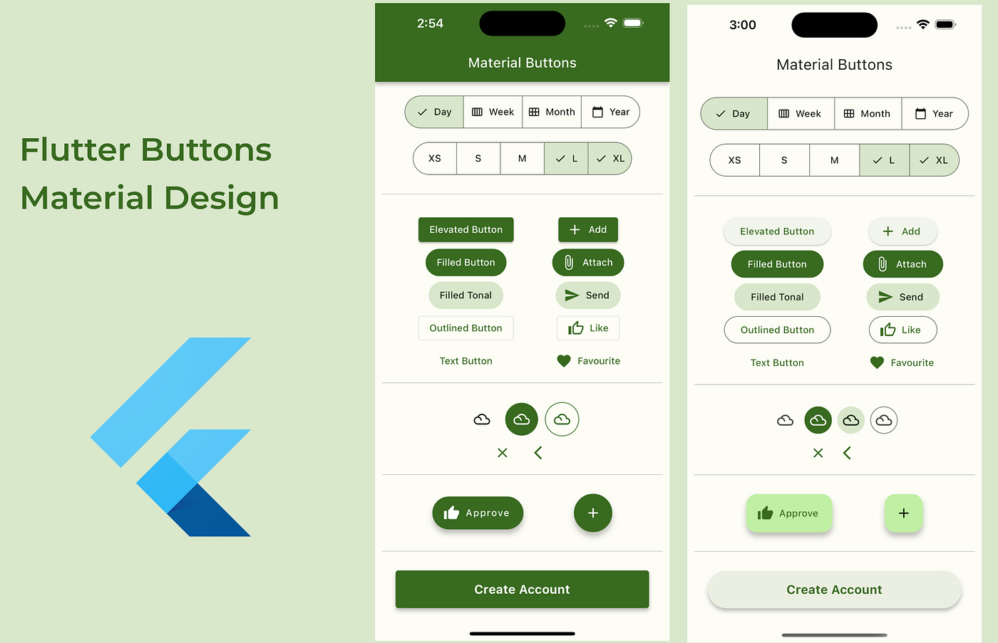
Types of Buttons in Flutter
Flutter offers multiple types of buttons that fit different needs. Let’s look at the most commonly used ones:
1. ElevatedButton
It’s a button that looks like it’s lifted off the screen. Best used when you want the button to stand out.
2. TextButton
This is a flat button with no shadow. It looks like plain text and is used for less important actions.
3. OutlinedButton
This button has a border around it. It’s used when you want a clean, minimal style.
4. IconButton
This one only shows an icon (like a heart, star, or share symbol). Perfect for social apps.
Basic Structure of a Button
All Flutter buttons follow a simple structure. Even though we’re not diving deep into code here, here’s a simple way to understand it:
- Child – What’s inside the button? Usually text or an icon.
- onPressed – What should happen when the button is clicked?
- Style – How should the button look? (color, shape, size)
So, every time you make a button, you are deciding these three things.
How to Create Your First Flutter Button
Let’s take an example: you want a basic button that says "Click Me."
Here’s what you do (in simple steps):
- Choose a button type (e.g., ElevatedButton)
- Add a child text to it
- Tell it what to do when pressed
This is how Flutter helps beginners make fully working buttons in just a few minutes.
Pro Tip: Start with ElevatedButton when learning for the first time. It’s the most beginner-friendly.
Styling Your Button the Right Way
Design plays a big role in how users feel about your app. A boring button might be ignored, while a well-designed one grabs attention.
Here’s what you can change while styling:
- Background color – Choose from blue, green, red, or even gradients.
- Text style – Make it bold, change the size, or switch the font.
- Shape – Rounded corners or square edges? Your choice.
- Padding – Give space around the text to make the button feel roomy.
“Design is not just what it looks like and feels like. Design is how it works.” – Steve Jobs (Source)
Using Flutter’s style property, you can make a basic button look modern and attractive.
Adding Functionality (Make It Do Something!)
A button is useless if it doesn’t do anything.
So, how do you add functionality?
Each button has an onPressed property. This is where you tell the button what to do.
Examples:
- Show a message (like “Hello World!”)
- Go to a new screen
- Submit a form
- Change the color of something
Tip: Start with simple actions first, like printing a message. Later, you can move to navigation and form control.
Common Mistakes Beginners Make
Don’t worry, we all mess up when starting out. But here are some things you can avoid:
- Forgetting to add onPressed – The button won’t do anything without it.
- Using too many buttons – It clutters the screen.
- Bad color contrast – Make sure your button text is easy to read.
- Using the wrong button type – Don’t use an ElevatedButton when a TextButton would be better.
Learn Flutter the Right Way – Join Uncodemy
Want to become a Flutter pro and build cool apps from scratch? Join Uncodemy’s Flutter Development Course. Learn from industry experts, work on real projects, and become job-ready in just a few weeks.
Uncodemy helps you learn faster with fun projects, clear explanations, and full support, just the way beginners love.
Advanced Styling Tips: Make Your Buttons Stand Out
Once you know the basics, it’s time to give your buttons some personality. Flutter allows deep customization, so you can match your app’s theme and make buttons that users love to tap.
Here’s what you can explore:
1. Rounded Corners
Want soft, modern buttons? Use RoundedRectangleBorder to curve the edges.
2. Add Icons to Buttons
You can combine icons and text using Icon and Row widgets inside the button.
Copy Code
ElevatedButton(

  onPressed: () {},

  child: Row(

    children: [

      Icon(Icons.thumb_up),

      Text('Like'),

    ],

  ),

)
3. Hover Effects
On web or desktop versions, add a visual effect when a user hovers over a button. This improves interactivity.
4. Gradient Backgrounds
Flutter doesn’t support gradient backgrounds directly in buttons, but you can wrap buttons in a Container and apply gradients there.
Custom Buttons in Flutter
Sometimes, the built-in buttons don’t match your design needs. In that case, you can create a custom button using GestureDetector or InkWell. These let you build a button using any widget and detect taps manually.
Use custom buttons when you need:
- Full design control
- Animations on tap
- Buttons inside cards or images
🛠 But remember: if built-in buttons work, use them! They are easier to manage and already optimized for accessibility.
Managing Button States: Enable or Disable?
Sometimes, you want a button to be disabled until certain conditions are met (like filling a form). You can do this by setting onPressed to null. Flutter then automatically greys out the button.
Copy Code
ElevatedButton(

  onPressed: isFormValid ? _submitForm : null,

  child: Text('Submit'),

)
This makes your app more professional and user-friendly.
Responsive Buttons for Every Screen
Your app may be used on phones, tablets, or desktops. That’s why you must design buttons that look good on all screen sizes.
Tips for responsive design:
- Use MediaQuery to adjust button width
- Avoid fixed sizes, use padding and Expanded widgets
- Test buttons on different screen sizes
Your goal is to create buttons that look balanced, stay centered, and are easy to tap on all devices.
Flutter Button Shortcuts: Save Time!
Flutter offers shortcuts to make your work easier:
- Use ButtonStyle for reusable styles across the app
- Wrap buttons in SizedBox to control height/width quickly
- Create a custom widget for buttons you use often
Example:
Copy Code
Widget myButton(String text, VoidCallback onPressed) {

  return ElevatedButton(

    onPressed: onPressed,

    child: Text(text),

    style: ElevatedButton.styleFrom(primary: Colors.blue),

  );

}
Now you can reuse this myButton() anywhere in your app with just one line.
Quick Answer: Adding Buttons in Flutter Made Easy
To create buttons in Flutter, use built-in widgets like ElevatedButton, TextButton, or OutlinedButton. Each type serves a different purpose, from bold call-to-actions to simple navigation. Add the onPressed function to define what the button does, and use the style property to change color, shape, or size.
Conclusion
Buttons are small but powerful tools in Flutter apps. They connect users with actions. By learning how to create, style, and manage buttons, you’re building a smoother, more professional user experience.
Keep exploring Flutter’s flexibility. There’s always a smarter, faster way to do things and once you master buttons, everything else becomes easier.
Still Learning? Uncodemy’s Got Your Back 🎓
If you’re serious about learning Flutter and building real apps, join Uncodemy’s Flutter Development Course. It covers everything from basic UI elements to advanced state management. You’ll get expert guidance, hands-on projects, and a certificate that helps you stand out in tech interviews.
Start building your dream app, one button at a time, with Uncodemy.
FAQs: How to Create Buttons in Flutter
Q1: What’s the easiest way to make a button in Flutter?
Use ElevatedButton. It’s simple, clear, and works well for most use cases.
Q2: How do I make a button do something?
Use the onPressed property. Add your function there, like showing a message or moving to another page.
Q3: Can I make a button round in Flutter?
Yes, by using RoundedRectangleBorder or wrapping it with styling properties.
Q4: How can I add an icon inside my button?
Use a Row widget and place both Icon() and Text() inside the button’s child.
Q5: When should I use custom buttons?
Use custom buttons when the default ones don’t meet your design needs or you want special animations or effects.