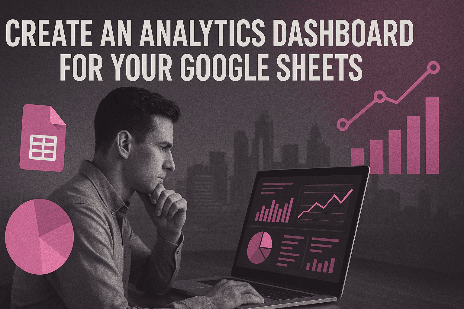
Learning the Google Sheets Dashboard
A data visualization tool is a Google Sheets dashboard, which is a way of structuring important data and information, such as key metrics and KPIs, as well as other essential elements of a spreadsheet, in a form crucial to understanding. In specific, dynamic dashboards can instantaneously refresh data whenever changes materialize which aids to pull up emergent trends, data-analyze areas of concern and solve the problem at hand in real-time. Real-time update facility is necessary in handling time-sensitive cases or companies whose KPIs keep on changing readily.
Advantages of Google Sheets Dashboards
Instant Updates, and Effortless Editing:KPI changes are made and visible in real-time and raw data is transformed into charts quickly using dynamic dashboards in Google Sheets.
Drill Down on Insights:Unlike the static dashboard, dynamic dashboards also allow one to drill down by clicking on the graphs to have the real-time information and thus when a KPI fails; it can be rectified in real time.
Availability and Teamwork:Google Sheets is based on the cloud where multiple users can collaborate on the same document and access the same document in any location, thus increasing its efficiency on cross-collab-orative relationships.
Google Suite Integration:Dashboards in Google Sheets support the rest of Google Workspace and it is possible to import data directly (in Google Analytics, Google Forms, Google Slides, etc.). It also has Google Looker integrated offering customizable and interactive dashboards with a drag-and-drop editor.
Cost-Effectiveness:Google Sheets is free to use, and it can be called cost-efficient in regard to the creation of dashboard applications in comparison to other paid programs.
Tutorial: How to create a dynamic dashboard in Google Sheets
The whole process of creating an interactive dashboard varies from extracting raw data to locking visualisations in Google Sheets.
1. Processing Raw Data
The first thing is to log in and sort crude information in a Google spreadsheet. Upon uploading data, it is advisable to run a pivot table report in order to detect the anomalies and to learn the data. The information may be entered manually, using Google Forms, or obtain the data by importing it, (such as Google Analytics or CSV). In big data, to ensure that the data becomes meaningful it is possible to accumulate information provided to the data as day, time, timezone, sales channel and country of a buyer. As an example, sales information can be organized to have the total sales during a quarter, sales per team, sales per product and best sales agents.
2. Google Sheet Basic Functions
A very important aspect of working with Google Sheets functionality in a dynamic dashboard is familiarity with the functions.
VLOOKUP:This is to follow a key value in a given column within a specific range which behaves as a search value key.
SUM/SUMIF:a SUM adds all the data in a column of data, whereas SUMIF adds only under a condition.
AVERAGE:It is used to find the mean of data in a column.
COUNT:Counts cell with a number.
Sparkline:Dynamic small graphs that display progress in measures over the time.
ARRAY_CONSTRAIN:Uses specified rows and columns in an input range to give a subset.
FILTER:Filters the data sets to an even greater degree of precision by the use of subfunctions of range and conditions.
IMPORTRANGE:This formula enables reading data of up to thousands of different spreadsheets files into one given dashboard spreadsheet, each on a separate tab. This helps in joining the data of the various google sheets files.
QUERY:It is actually usable to cluster and sort data to be analyzed; such as to locate best sales agents.
ARRAYFORMULA:Duplicates a formula/needed across an entire array, thus helpful in managing subsequent data insertion, without ever having to manually copy it.
3. New Tab Creation and Data visualization
It is recommended that a new tab can be made where the dashboard information can be stored temporarily. Google Sheets provides a number of data presentation tools, such as tables, pivot tables, charts, graphs and timelines.
Charts and Graphs:These are categorized as major aspects of dynamic dashboard that enables high level analysis of a big quantity of data and its visualizing. The chart is continually updated with changes in raw data. There are 8 types of charts supported by Google Sheets and one of them is the column (bar) chart.
Pivot Tables:These are summarisers of big databases; they condense the big data to form the unitised data so as to extract a set of specific data. Unlike formulas they are quick and effortless in coming up with insights and minimize human error.
Slicer Function:Assists with a task to slice away data and focus on the more relevant part and plays a crucial role in stopping charts and graphs in dynamic dashboards.
Conditional formatting:This is applied to filter data, apply color schemes or to mask unwanted data and is very useful when a specific goal is wanted in relation to value range.
4. Data Validation Then using
Data validation also makes a drop-down menu to ensure the parameter is chosen, e.g. sales channels or a certain time period. This is one of the ways of updating data without code writing and gets labeled as easy and effective.
5. Inserting Datavalidation Values into Filter Function
In order to complete a dynamical dashboard, values of data validation are fed in the filter function. This supports filtering any data field two-times with simple operators such as <, > or=. Dashboard can be then tested after putting in filters to see alteration of data in the new tab.
6. Creating Styles and Formatting
Both raw data and charts may be formatted. Charts: The possibilities here are the choice of graph type, altering the color and font, altering the axes, addition of error bars, data labels, trend lines and switching on gridlines. The last activity is the establishment of pies and charts on aesthetic grounds.
7. Publicity of the Dashboard
Dynamic dashboards created with Google Sheets need to be shared in terms of charts that are published on a webpage to achieve shareability. This will include copying all charts to a new sub-sheet, followed by the use of the publish to web option, choosing all charts option of the drop down menu.
Google Sheets Dashboards Shortcomings
Though Google Sheets is handy, it is not a good dashboarding tool:
Expense of Maintenance and Possibility of Mistakes:Dashboards may easily be spoiled by an amateur teammate, and it is likely to lead to a leak accidentally when shared. Multiple KPIs can also be hard to sustain since there are numerous manual processes in maintaining dashboards.
Poor Mobile Usability:Google Sheets has not been designed ideally in mobile, and work in the mobile version of Google Sheets is problematic since it has to scroll both horizontally and vertically in addition to editing the text with difficulty.
Inadequate Automation and Advanced Data Visualizing:Google Sheets do not adequately automate the data importation and collection of data by various sources and do not have AI-driven capabilities to derive information. Neither does it have a complete range of data visualization capabilities as others spreadsheet programs do nor does it provide interactive and error-free visualizations without exposing complete logic.
Uncodemy Courses and Other Learning Material
Numerous online courses could assist in learning how to use Google Sheets in building a dashboard. Although the exact search was made under the name of the "Uncodemy courses" the documents given refer to the different courses available on other providers.
Udemy:Has courses such as the Advanced Google Sheets: Automate, Analyze & Build Dashboards, where one learns how to create interactive Google Sheets dashboards with pivot tables, charts, slicers, and smart filters. The other Udemy course is devoted to Google Sheets - Dashboard Design, posing the question of the use of the built-in dashboard construction functions.
Coursera:Offers a project-based course under the name of Create Charts and Dashboard using Google Sheets that is going to introduce participants to how to create effective charts and dynamic dashboards in two hours.
DataCamp:Provides an online course named DataVisualizationinGoogleSheets, which teaches business intelligence and dashboarding using data, and how to organize data to create a simple dashboard.
Better Sheets: Offers courses such as, "Build Better Dashboards" that offer practical training on the concepts of creating effective dashboards, significant Google Sheets capabilities, and sequential steps of building example dashboards.
In these courses, key methods of creating effective dashboards are frequently discussed, including the need to gather responses of the user through Google Forms, data retrieval using LOOKUP formula, and data interpretation using logic. They also engage the learning of advanced Google Sheets formulas.