Understanding Flexbox
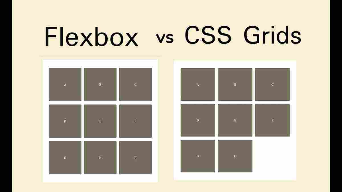
The Flexible Box module, frequently called Flexbox, is meant to lay out a set of items in one direction, as a row or a column. It grants a lot of control to the placement and distribution of items in that single axis. In order to apply Flexbox you set display: flex on the parent container, and that establishes a flex formatting context to its immediate children. Naturally, all the items will stack horizontally in the row, and that can be altered to be in the column by using flex-direction property.
Important attributes of Flexbox and their applications
Flex Direction (flex-direction):This is a property which determines the main axis, which determines the direction in which items placed by flex are directed. As an example: flex-direction: row and flex-direction: column will line up items in a left-to-right orientation and top-to-bottom respectively. All the rules of Flexbox work are based on this main axis and perpendicular criss-cross axis.
Wrapping (flex-wrap): flex items will by default attempt to wrap onto fewer lines, but flex-wrap can be used to give the flexibility to fit on multiple lines when necessary. An example is that wrap makes items flow top down and wrap-reverse flows bottom up. Where flex-wrap: wrap has been set each row will effectively be its own mini flex container so items can be set to not shrink below any hypothetical size where wrapping out is possible.
Justification (justify-content, align-items, align-self, align-content).
justify-content aligns items on the main axis, where the additional space is directed.Such values as space-between equal-distributes the items with space in between, space-around puts the same space on each side of each item and center puts the items at the center point.
align-items determines the default binding on how flex items get arranged along the cross axis of the current line. As an example, the center centers around the cross-axis, and the flex-start line begins to.
align-self enables the specification to override the default alignments as specified by align-items on a per-flex basis.
align-content does the same to the line-aligned flex container when there is additional space on the cross-axis hence corresponding to justify-content on the main-axis. The property works only in multi-line flexible containers with flex-wrap of either wrap or wrap-reverse.
Flexibilidad (flex-grow, flex-shrink, flex-basis, flex)
flex-basis defines the initial size of an element first, and then allocates the rest. It behaves as width in a flex row and height in a flex column and is always pegged to the primary axis.
flex-grow is what determines how an item can expand and occupy the provided space available in the flex container. When a flex-grow value is set to 0, an item does not grow. In case several children possess flex-grow values, the additional space is split pro rata between those children.
flex-shrink determines what can shrink provided that something in it is too big in terms of the container. flex-shrink by default is 1, or items scale down proportionally. Flex-shrink: 0 stops an item shrinking below the flex-basis.
flex is a short property that merges flex-grow, flex-shrink and flex-basis. The intelligent default is suggested to be written in this shorthand.
Stages (gap, row-gap, column-gap):Zones between flex elements are controlled explicitly by the gap property with spacing being performed at the boundaries of the elements it separates and not the edges.
Auto Margins:Auto margins are capable of consuming additional spaces on a flex container giving it a precise control on the distribution of space. To take an example, we can have margin-left: auto or margin-right: auto to move items to right or left respectively, in a navigation bar.
Live Demos of Flexbox Applications
The usage of flexbox is currently popular in current websites because of being responsive to mobile devices.
Typical uses are:
Navigation Bars:A common layout in navigation would be to have the contents of navigation as a list in horizontal display, the justification is handled using the justify-content. Equally sharing available space is possible too: flex: 1 or flex: auto.
Vertical Centering:Flexbox can make vertical centering of content in a container easy, by using the properties: align-items: center as well as justify-content: center.
Card Layouts:By making the cards themselves a flex container with flex-direction: column and the footer an area flex: 1, Flexbox can be used to make the footers stick to the bottom of the cards even when content is of variable height.
Media Objects:To make the image and the description appear side by side, Flexbox lets the media object be the size of the picture, and lets the content flexibly fill the rest of space.
Form Controls:Flexbox can be used to style form controls as it lets the input fields stretch and contract with form labels and buttons keeping to their size.
The following resources give live examples and demos of Flexbox as well as code examples: MDN Web Docs, Quackit, and WebUp.org.
Concept of CSS Grid
CSS Grid Layout is a 2D grid layout model aimed to help you arrange content on the grid both horizontally and vertically. Grid is flexible as far as designing layouts of pages gets concerned as opposed to Flexbox which is an one-way process. A grid is defined on a container element with display: grid or display: inline-grid.
CSS Grid properties and Uses
Grid Definition (grid-template-columns, grid-template-rows):The columns and rows of the grid are defined using these properties which specify track sizes. The lengths of tracks may be lengths (e.g., px, rem, em) or percentages or fractions of free space with the unit fr. In Flexbox, the fr unit gives out available space once non flexible objects are sized like flex-grow.
Implicit and Explicit Grids:
A grid-template-rows and grid-template-columns specify an explicit grid. This is handy in the construction of fixed layout such as that of the header-sidebar-main-footer.
An implicit grid is achieved when items are placed lying beyond the explicit grid leading to Grid creating extra tracks when required. By default, these implicit tracks are auto-sized, however, you can exercise control over them using grid-auto-rows and grid-auto-columns.
Placement of Items in the grid (grid-column, grid-row, grid-area):
With the help of span keywords, items can cross several tracks.
Named Grid Lines:Arbitrary names can be assigned to lines and so are easier to read than numbers. As an example, grid-column: aside-start / aside-end would position an item between the lines called aside-start and aside-end.
Grid Template Areas (grid-template-areas):This will enable you to specify a grid template based on referencing named grid areas giving you visual control of the layout right in CSS. When the same name is repeated across the cells we extend the contents of that name across the same cells, and when the same period (.) we mean an empty cell. It makes it easier to redefine layouts using media queries.
Gaps (gap, row-gap, column-gap): Just like Flexbox, the property gap generates space between grid tracks (rows and columns). These discontinuities are used as gutters of minimum width.
Versus JustifyContent, Versus justifyContent, Versus justify-items, Versus alignItems, Versus justify-self, Versus align-self:
justify-content Distributed space amidst rows on the fundamental component.
align-content suspends extra space between rows on the block-axis.
justify-items align within their columns.
align-items aligns items in their rows.
justify-self manages the horizontal relationship of a given grid child.
The align-self is used to affect vertical placement of a particular grid object within its cell.
Live examples of using CSS Grid
CSS Grid has become widely adopted and there are many real-life examples to be found to motivate developers. Although older browsers such as IE10 or IE11 might not be fully compatible with the latest Grid specification, more modern browsers usually support the latest specification natively — with no prefix.
One can see examples of CSS Grid in action:
Defining Grids:It is possible to include demonstrations of how to define column and row tracks with display: grid and grid-template-columns/grid-template-rows.
Line-Based Placement:Examples of how to place items on line numbers or named lines are given.
Spanning Tracks:Demonstrations cover how to get things to span multiple grid tracks.
Named Areas:grid-template-areas for creating intuitively understandable layouts with named areas.
Responsive Layouts:Media queries allow the redesigning of layouts with Grid, which eliminates the creation of complicated CSS to make the designs flexible.
Auto-Placement:The case of grid placing items into cells automatically and how this may or may be used together with manual placement is illustrated.
Complex Structures:Something like a header-sidebar-main-footer is terrific with a grid.
Guidelines around the use of CSS Grid Layout, such as those listed in the sites: Grid by Example, GridExamples.com, MDN Web Docs and Quackit offer numerous live demos and explanations of how CSS Grid functions. Probably the biggest websites using CSS Grid are Slack, Stripe, The New York Times, The Telegraph, BuzzFeed News, and Smashing Magazine.
Uncodemy Flexbox and Grid
At Uncodemy, we have frontend development courses which address these main layout concepts in CSS Grid and Flexbox. Frontend training course at Uncodemy is an advanced curriculum, and practical tracing with the trainers of professional career experience who are well experienced in their field.The course gives importance of whole image learning inclusive of trained mentorship and webinars with industry experts. Before the final test, students may undergo several tests to be sure that they are prepared and make no doubts about their skills.