Table of Contents
1. What Is Responsive UI Design?
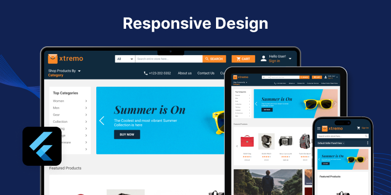
Responsive UI design means creating layouts that adapt to different screen sizes. Your app should look amazing whether it’s opened on:
- A small mobile screen
- A large tablet
- A full web browser
It doesn’t mean just resizing things. It means rearranging, hiding, showing, or adjusting widgets to make the experience smooth on every device.
2. Why Responsive Design Is Important
Imagine opening an app on your iPad and the content is squeezed to one side. Or the text is too small to read on your mobile. Frustrating, right?
That’s why responsive design matters:
- Improves user experience
- Increases engagement
- Boosts your app’s ratings and reviews
- Makes your app look professional
According to Google’s research, 53% of mobile users will leave a website if it takes more than 3 seconds to load.
And nearly 40% of users stop interacting if content loads slowly or images fail to appear. (Source)and(Source)
3. Flutter and Its Power for UI
Flutter is known for its beautiful UI and fast performance. It uses a widget-based system, which gives you full control over layout and design.
But here's the cool part: Flutter comes with built-in tools that make responsive design easier than ever.
You don’t need tons of third-party libraries. Flutter gives you:
- Flexible widgets like Expanded, Flexible, Wrap
- MediaQuery to get screen size
- LayoutBuilder to adjust layout based on constraints
- OrientationBuilder to change layout in portrait/landscape
We’ll explore some of these tools soon in this guide.
4. Core Principles of Responsive UI in Flutter
Before jumping into the steps, it’s important to understand the mindset of responsive design. It's not just about shrinking or stretching widgets.
Here’s what you need to think about:
- Content Prioritization: Show most important stuff first
- Flexible Layouts: Use percentage-based widths/heights, not fixed pixels
- Widget Visibility: Hide or show elements depending on screen size
- User Behavior: Think about how users interact with the app on small vs. big screens
"Design for the thumb, design for eyes, design for all."
5. Getting Started: Setting Up Your Project
To start creating responsive UI in Flutter, make sure:
- Flutter SDK is installed
- You’re using Flutter 3.0 or later (for best compatibility)
- You’ve created a new Flutter project using:
flutter create responsive_ui_demo
Then open your project in your favorite editor (like VS Code or Android Studio).
Pro Tip: Use an emulator and test with different screen sizes from the start. It’ll help you catch layout bugs early.
6. Step-by-Step Guide to Building Responsive UI (Part 1)
Let’s now go step-by-step to build your first responsive screen in Flutter.
Step 1: Use MediaQuery
MediaQuery helps you get the current screen’s width and height.
Example:
final screenWidth = MediaQuery.of(context).size.width;
You can use this to adjust font sizes, padding, or layout rules.
Step 2: Use Flex Widgets
Flutter gives you super useful widgets like:
- Expanded: Makes a child fill up available space
- Flexible: Lets you control how a child resizes
- Wrap: Helps when children overflow (like buttons or chips)
These widgets help create fluid layouts that adjust to screen size.
Step 3: Use Percentage Width
Never hardcode widths like 300px. Instead, use something like:
Copy Code
Container(

  width: screenWidth * 0.8, // 80% of screen

)
That way, the UI stays smooth on all devices.
7. Best Practices for Beginners
Want to avoid common mistakes in Flutter responsive UI? Follow these beginner-friendly tips:
✔ Don’t use fixed-size widgets unless needed
✔ Always test in different screen sizes
✔ Use SafeArea to avoid notches and system UI
✔ Avoid too many nested Rows and Columns
✔ Use fonts that scale (TextStyle with fontSize based on screen)
Uncodemy Can Help You Master Flutter
If you’re serious about becoming a Flutter pro, check out Uncodemy’s Flutter Development Course. It’s beginner-friendly and helps you go from basics to advanced projects step by step.
You’ll learn how to create responsive, real-world apps with expert support.
8. Step-by-Step Guide to Building Responsive UI (Part 2)
We’ve already used MediaQuery, flexible layouts, and percentage-based sizing. Let’s now go deeper into some smart tools Flutter gives for responsive UI.
Step 4: Use LayoutBuilder
LayoutBuilder is a powerful widget. It helps you decide what to show depending on how much space is available.
Copy Code
LayoutBuilder(

  builder: (context, constraints) {

    if (constraints.maxWidth > 600) {

      return LargeScreenWidget();

    } else {

      return SmallScreenWidget();

    }

  },

)
This is super helpful for apps that run on both tablets and phones.
Step 5: Try OrientationBuilder
OrientationBuilder lets your app react to the device’s orientation (portrait or landscape).
Why does it matter?
- In landscape, you may want to show items side-by-side
- In portrait, stack them vertically for better readability
Copy Code
OrientationBuilder(

  builder: (context, orientation) {

    return orientation == Orientation.portrait

      ? VerticalLayout()

      : HorizontalLayout();

  },

)
Using this builds smarter UIs that work naturally.
Step 6: Use AspectRatio and FittedBox
These widgets help maintain design proportion and size across devices.
- AspectRatio keeps shapes like images or videos in the right ratio
- FittedBox scales your widgets to fit the screen space without overflowing
These help avoid broken or stretched layouts on different devices.
Step 7: Group Layouts Using Custom Breakpoints
You can create custom breakpoints (screen width ranges) to switch between different layouts.
Example:
Copy Code
if (screenWidth < 400) {

  return SmallScreenLayout();

} else if (screenWidth < 800) {

  return MediumScreenLayout();

} else {

  return LargeScreenLayout();

}
Use these carefully. Too many breakpoints = messy code.
Step 8: Use Responsive Design Packages (Optional)
Flutter also has plugins like flutter_screenutil or responsive_framework to help with scaling.
But for most apps, native tools are enough. Start simple, then scale.
9. Testing Your Responsive UI
Building is one thing. Testing is where you catch issues early.
Here’s how to test your Flutter app responsiveness:
- Use emulators for small, medium, and large screens
- Rotate device and test in both orientations
- Test on web, mobile, and tablets
- Check accessibility (fonts, buttons, spacing)
Bonus Tip: Use Flutter’s Device Preview package during development. It shows how your app looks on multiple devices inside your editor!
10. Common Responsive UI Mistakes to Avoid
Even experienced Flutter devs mess this up. So here are mistakes to avoid:
✖ Using fixed width/height everywhere
✖ Not checking layout in landscape
✖ Forgetting SafeArea your UI might get cut off
✖ Too much nesting it slows down your app
✖ Ignoring text scaling users with poor vision suffer
11. Real-World Use Case: News App
Imagine a news app built with Flutter.
On mobile:
- One column layout
- Small images, short previews
On tablet:
- Two-column layout
- Bigger images, more space for reading
On web:
- Multi-column layout
- Ads and extra sections on sides
Responsive UI lets one app work beautifully on all these. You don’t need different codebases.
12. Best UI Design Patterns for Flutter Responsive Apps
Here are some simple, modern patterns to follow:
- Card Layouts – Great for lists and feeds
- Grid Views – Works well with photos and product listings
- Split View – Ideal for larger screens (like mail apps)
- Navigation Drawer + AppBar – Keeps UI clean on any device
✔ These patterns are easy to build with Flutter's built-in widgets.
13. Learn With Uncodemy (Again!)
Want to learn responsive Flutter UI with real apps, live help, and projects?
Join Uncodemy’s Flutter Development Masterclass – it covers:
- UI from scratch
- Responsive layouts
- Backend + Firebase
- Real-world projects (news app, e-commerce, admin panel)
It’s perfect for students, job-seekers, and career switchers.
Boost your skills. Build better apps. Get job-ready.
Quick Answer: How to Make Responsive UI in Flutter
To build responsive UI in Flutter, use tools like MediaQuery, LayoutBuilder, OrientationBuilder, and Flex widgets. These help your layout adjust smoothly to screen size, orientation, and device type, ensuring a great user experience across mobile, tablet, and web.
Final Tips for Building Beautiful Responsive UIs
Let’s wrap with some quick pro tips:
- Think mobile-first, then scale up
- Use percentage widths, not fixed pixels
- Use Flutter tools first before trying extra packages
- Always test in multiple sizes
- Focus on user comfort spacing, readability, tap areas
Flutter makes responsive design fun if you follow the right approach!
Conclusion: Design Once, Impress Everywhere
Responsive UI Design in Flutter is not just about “fitting” your app to screens. It’s about creating a smooth, beautiful experience for every user, no matter what device they’re using.
With Flutter’s smart tools like MediaQuery, LayoutBuilder, and OrientationBuilder, you don’t need to write different code for different screens. You just need the right mindset and layout logic.
So next time you start building a Flutter app, don’t stop at just “making it work.”
Make it responsive. Make it amazing. Make it unforgettable.
And if you ever feel stuck, remember platforms like Uncodemy are here to guide you, step by step, from your first layout to your first real-world app.
Let your UI adjust. Let your skills grow.
Let your Flutter journey take off.
FAQs
Q1. What is Responsive UI in Flutter?
It’s a way to build layouts that adjust to different screen sizes and orientations using Flutter widgets like MediaQuery, LayoutBuilder, and Flexible.
Q2. Is Flutter good for responsive design?
Yes! Flutter offers built-in tools to easily create responsive designs for mobile, tablet, and web platforms.
Q3. Do I need to learn packages for responsive UI in Flutter?
Not really. You can build great UIs using Flutter’s core widgets. Packages help but are optional.
Q4. How do I test my Flutter app on different screens?
Use emulators, real devices, and Flutter’s Device Preview package to test different screen sizes and orientations.
Q5. Can Uncodemy help me learn Flutter?
Absolutely. Uncodemy’s Flutter course is designed for beginners and helps you master UI, responsive design, backend integration, and real-world projects.