1. Why Time Complexity Graphs Matter
When you’re picking between algorithms, you’re not just looking at theoretical performance you want to see how they behave in real scenarios. That’s where graphs come in:
- Visual intuition: The difference between O(n) and O(n log n) becomes crystal clear.
- Predict actual runtime: Helps you estimate performance on real inputs.
- Spot inefficiencies: A sudden spike reveals trouble earlier than dry code reviews.
Let’s start drawing!
2. Plotting Time Complexity: A Simple Walkthrough
Suppose you have two functions in Python:
Copy Code
def linear_search(arr, target):

    for i, val in enumerate(arr):

        if val == target:

            return i

    return -1

def binary_search(arr, target):

    low, high = 0, len(arr) - 1

    while low <= high:

        mid = (low + high) // 2

        if arr[mid] == target:

            return mid

        elif arr[mid] < target:

            low = mid + 1

        else:

            high = mid - 1

    return -1
To plot a time complexity graph, measure runtime for increasing input sizes.
Copy Code
import time, random

def measure_time(func, size):

    arr = list(range(size))

    target = -1  # worst-case

    start = time.time()

    func(arr, target)

    end = time.time()

    return end - start

sizes = [1000, 2000, 5000, 10000, 20000]

for size in sizes:

    t_linear = measure_time(linear_search, size)

    t_binary = measure_time(binary_search, size)

    print(size, t_linear, t_binary)

You’ll get outputs like:

1000 0.00012 6e-05

2000 0.00025 8e-05
Plotting these gives your time complexity graph with input size on the X-axis and runtime on the Y-axis.
3. Visualizing Complexity Using Matplotlib
Let’s turn those printed numbers into a plot.
Copy Code
import matplotlib.pyplot as plt

sizes = [1000, 2000, 5000, 10000, 20000]

times_linear = [0.00012, 0.00025, 0.00065, 0.0013, 0.0026]

times_binary = [0.00006, 0.00008, 0.00012, 0.00015, 0.00018]

plt.plot(sizes, times_linear, label='Linear Search (O(n))')

plt.plot(sizes, times_binary, label='Binary Search (O(log n))')

plt.xlabel('Input Size')

plt.ylabel('Time (seconds)')

plt.title('Time Complexity Graph')

plt.legend()

plt.show()
When you run this, you’ll see two curves: the linear curve climbing faster, the binary curve staying relatively flat. A simple yet powerful visual!
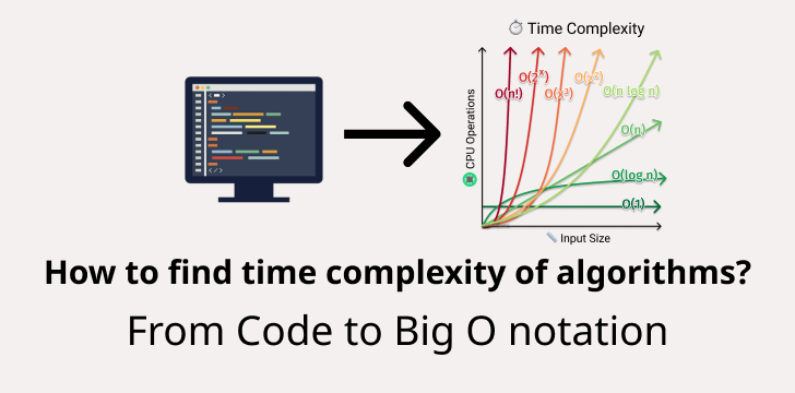
4. Common Complexity Graph Shapes
Here’s how different complexities tend to look:
- O(1): Flat line
- O(log n): Slowly rising curve
- O(n): Straight diagonal
- O(n log n): Slightly steeper curve
- O(n²): Parabolic rise (expensive)
- O(2^n): Explosive growth
5. Efficiency Beyond Code: Real-World Impacts
- Search operations: Linear vs binary search in large datasets
- Sorting algorithms: QuickSort vs Bubble Sort see the difference on big data
- Databases: Indexing methods rely on log(n) operations for speed
- Machine Learning: Training with O(n²) loops costs more time as data grows
6. Tools & Tips for Accurate Graphing
- Use time.perf_counter() for precision in Python
- Run multiple trials and average results to minimize noise
- Use logarithmic axes when ranges are large
- Annotate graphs for clarity: mark input sizes, explain curves
7. Real Example: QuickSort vs Bubble Sort
Copy Code
import random, time

import matplotlib.pyplot as plt

def bubble_sort(arr):

    n = len(arr)

    for i in range(n):

        for j in range(0, n - i - 1):

            if arr[j] > arr[j+1]:

                arr[j], arr[j+1] = arr[j+1], arr[j]

def quick_sort(arr):

    if len(arr) <= 1:

        return arr

    pivot = arr[len(arr)//2]

    left = [x for x in arr if x < pivot]

    mid  = [x for x in arr if x == pivot]

    right= [x for x in arr if x > pivot]

    return quick_sort(left) + mid + quick_sort(right)

def measure(func, size):

    arr = random.sample(range(size * 3), size)

    start = time.perf_counter()

    func(arr.copy())

    return time.perf_counter() - start

sizes = [500, 1000, 2000, 4000]

times_bubble = [measure(bubble_sort, s) for s in sizes]

times_quick = [measure(quick_sort, s) for s in sizes]

plt.plot(sizes, times_bubble, label='Bubble Sort O(n²)')

plt.plot(sizes, times_quick, label='QuickSort O(n log n)')

plt.xlabel('Input Size')

plt.ylabel('Time (seconds)')

plt.title('Time Complexity Graph: Sorting')

plt.legend()

plt.show()
The curves will dramatically diverge bubble sort skyrockets, quicksort remains relatively manageable. This visually reinforces why bubble sort is a no-go in big data contexts.
8. Interpreting Your Time Complexity Graph
What to look for:
- Flat = O(log n) or O(1) - efficient
- Linear = O(n) - moderate
- Parabolic = O(n²) - risky on big datasets
Even with O(log n) algorithms, watch out for huge constants or overheads that hide inefficiencies at smaller scales.
9. Learn More with Uncodemy
Want to get serious about data structures, algorithm analysis, and practical graph plotting? Check out Uncodemy’s Data Structures & Algorithms Course.
They offer hands-on projects, clear visualizations, and expert-led lectures to make these concepts stick.
Best Practices for Your Graph Studies
- Use multiple input sizes to avoid one-off anomalies
- Always label axes and curves clearly
- Use both linear and log scales to get deeper insights
- Annotate thresholds or inflection points where algorithm performance changes dramatically
FAQs About Time Complexity Graphs
Q1. What is a time complexity graph?
A plot of input size vs runtime helps visualize algorithm efficiency.
Q2. Why prefer graphs over Big O notation alone?
Because graphs show real behavior constant factors, input scaling, and real-world performance.
Q3. Can I use graphs for memory complexity too?
Absolutely! Memory usage vs input size can be visualized the same way.
Q4. How many trials should I run?
Aim for 5–10 runs per input size and average the results to smooth out variability.
Q5. What if my graph isn't smooth?
That's normal measurement noise, background tasks, or caching effects can cause fluctuations. More trials help.
Final Thoughts
A time complexity graph doesn’t just look pretty it tells you exactly how your algorithm behaves as input grows.
It helps you make better choices, optimize smartly, and speak knowledgeably about performance.
With these strategies, you're not just writing code you’re thinking like an engineer.
So pick that function, start plotting, and discover the real-world efficiency hidden behind lines of code.