CSS Box Model
All objects in a webpage can be modeled as a rectangular box in the browser rendering engine--as per the standard CSS basic box model. This is a theory that defines how they are shown on the internet page and how they react to each other. The concept of the box model forms the foundation of the layout and placement of items, whether to the experienced developer or the would-be designer. It gives out a system of architecture that guides layouts on the web. The box model can also be used to establish a responsive layout which can fit different screens and screen sizes.
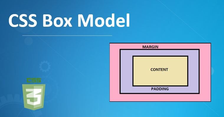
Elements of the CSS Box Model
Every CSS Box Model box has four different parts which include: content, padding, border, and margin. These elements specify the size, placement of elements and amount of space that they consume.
Content Box
The inner portion of the box, that actually contains the content in form of text, pictures or other media, is referred to as a content box. Its size is termed as content width and content height. The content box has a size, set by the width and height properties of the element. These are properties that are defaulted only to the contents box. An example would be that a content box (a part of a paragraph element) would automatically adjust to the text the box is containing. The content box can also be manipulated by adjusting the font size; doing so enlarges the box to fit the words, or with the assignment of a particular width and height.
Padding Box
The space between border and content is called padding. It puts a cushioning on the interior, so the content does not come into contact with the edge. Padding is important because it makes the contents easy to read and look good by giving it breathing space. Padding is a property which may be assigned top/right/bottom/left different values. To illustrate, padding: 20px; will add 20 pixels of padding in all directions whereas padding: 10px 0; just adds 10 pixels padding to the top and bottom. Padding values cannot be set negative as it is the case with margins. Background applied to the element will go beyond the padding.
Border Box
The border covers around the padding as well as the content areas. It could be styled with the help of such features as border-width, border-style, and border-color. Borders give visual differentiation and order to things, dividing a part of a web page. Borders may be defined side by side, or all side to side at once. An example is, border: 2px solid #333; which adds a 2-pixel solid border of a particular color. The border-radius attribute will enable you to make the edges of an element smooth and circle them. When box-sizing: border-box is set in the alternative box model, the width and height of the border is counted in the width and height of the element.
Margin Box
The margin is the outermost framework of the box, that makes a transparent space visible between the element and the surrounding ones. Margins regulate positioning and design of the complete web page. Margins are applied with the aid of the margin property that is able to have various figures on each side. Such as margin: 20px; which gives 20 pixels margin to all sides and margin: 0 15px; leaves 15 pixels on the left and right only. It permits negative margin i.e., it can overlap elements. Backgrounds of margin are transparent.
The box-sizing Property
The box-sizing property is core in determining how the overall width and height value of an element get calculated. It specifies whether to include padding and borders into the given width and height.
content-box (Default)
The box-sizing by default assumes the value content-box. The width and height properties are settable only to the content area in this model. Padding, border and margin are added around this content box increasing the overall size of the element. Consider, for example, an element 300px in content width, with 20px of padding on every side and 5px of border on every side; then the element would be 300px + (20px x ) + (5px x )=350px wide. Likewise, the total width to be 240px (200px +20px +20px) of an element that has a width of 200px, a padding of 20px, and border set to none.
border-box
When box -sizing is border-box, the stated width and height take into account the content, padding, and the border. This creates layouts that are more predictable, in particular responsive design, since the overall dimensions of the unit is unaffected by added padding and borders. Padding remains in addition to the border-box. A case in point is when an element has a width of 350px, with box-sizing: border-box, and has a 25px padding and 5px border on every side, the total width will continue to be 350px and the contents area will shrink accordingly. It is also conventional that developers use the box-sizing: border-box on all elements to make the calculations easier and layout consistent. This could be done on the <html> element and the rest of the elements inherit the value.
Effects on Design and Layout
The box model as implemented by CSS has a huge influence that can alter the layout and design of a web page, mainly due to the fact that size, space between elements and position are precisely controlled. Anything on a page is a building block and it can either stack, line up, or nest within a box. This enables structured and hierarchical designs to be made.
Responsive Design
Box model is vital in responsive design as it makes layouts easily able to fit in various screen sizes and devices. With the size of the dimensions, padding, and margins depending on the size of the screen, the developer can develop layouts that would elegantly fall onto different viewport numbers. Dynamic resizing of elements by ensuring that their layout is based on percentage values of the widths in the layout, is achieved through fluid layouts where elements use flexible margins. CSS frameworks (e.g., Bootstrap) and recent layout methods such as CSS Grid and Flexbox can also make the development of responsiveness designs further quicker and easier through the concepts of the box model.
Trouble shooting and best practice
Laying out layout issues through box models also depends on the knowledge of box models. Misconceptions relating to box-sizing, collapsed margin and overlapping items are typical.
Margin Collapsing:Vertical margins between neighboring block-level elements can collapse, i.e. the larger of the two in the set is used, instead of the total. A horizontal line never collapses however. Training in margin collapsing makes one avoid surprises of erratic spacing.
Browser Compatibility:Different browsers may interpret the box model slightly differently and may have slightly different properties. Compatibility testing in different browsers and devices determines and eliminates cross-device and cross-browser incompatibility.
Preventing Overlaps:Whereas panel overlaps by virtue of padding, margins and position, the panel experience and layout will be compromised. The stacking order of elements may be helped along by using CSS positioning and z-index.
Arrangement Layouts: To keep the complicated arrangement structured and comprehensible, it is possible to divide the layout into small and workable parts and apply such practices as BEM (Block, Element, Modifier) or CSS Grid.
Width Settings:When it comes to responsive design, it is usually advisable to use auto or percentage width, instead of pixel based fixed widths.
Absolute Positioning:Absolute positioning does have its use cases but when abused can cripple the responsive layout.
Nesting:Trend to organize layouts into blocks that hold them (such as Box, Section or Columns) and nest the elements within them is responsive.
Courses that Use the CSS Box Model Uncodemy
In case an individual is interested in expanding his/her knowledge regarding web design and the CSS Box Model, Uncodemy provides several training courses. These classes teach the basics of web technologies in detail including CSS concepts such as the Box Model.
Web Development Training Course:This training course at Uncodemy involves HTML, CSS, JavaScript, and framework. CSS Box Model is a fundamental part of CSS, and it is to be expected that this course contains considerable material about this element.
Uncodemy also provides a Web Designing Training course whose aim is to equip people with the skills of being successful web designers. Because of the pillar-like Box Model, it would be an important element of this curriculum.
Full Stack Developer Training Course:The Full Stack Developer Training Course as well lists CSS Box Model as one of the elements of its course material, which means that it is relevant to a greater extent of development.
CSS with C with Data Structure Certification Training:Things like Box Model, Display, Position, Align, Pseudo-classes are listed within even a course like CSS with C with Data Structure Certification Training. This implies that Uncodemy incorporates the principles of web design in multiple applicable IT courses that are related to both newbies and adept students.
Such classes, proposed by Uncodemy, act to equip students with foundational to advanced knowledge in terms of web design that would enable them to become confident in their ability to create visually attractive and functional web interfaces. Such structured learning may help the developer better master the CSS Box Model, and thus become able to generate captivating web experiences.